This week I’ve been playing a lot with developing colour guides from photos for my new blog style guide. The photo I used for that palette was reasonably straight-forward to translate into colour swatches, but sometimes there aren’t large slabs of colour to work with to get the right shade to create the feel you are after, so today I wanted to share a quick tutorial with you, and also show you how I used the palette in this case.
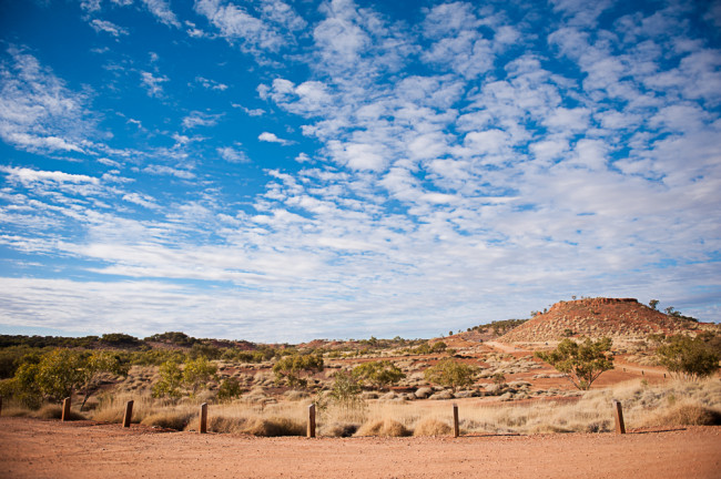
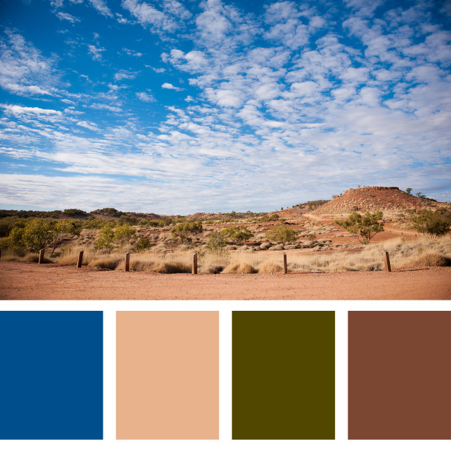
Firstly, it was a matter of picking a photo. To work with the final project, I needed a landscape issue, and chose this image from our 2013 Queensland road-trip.
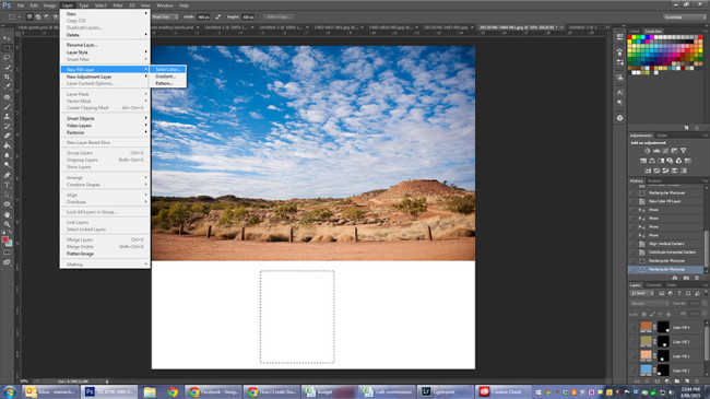
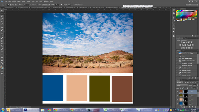
For this tutorial I am using Photoshop CS6. Photoshop Elements would use exactly the same steps, as I haven’t use any CS-specific tools, and most other photo manipulation programs should work in a similar way.
After opening the photo and using the Image -> Canvas size option to create a square file with a white bar across the bottom, I started layering in colour, using the rectangle marquee tool set to 400px x 600px and then adding fill layers:
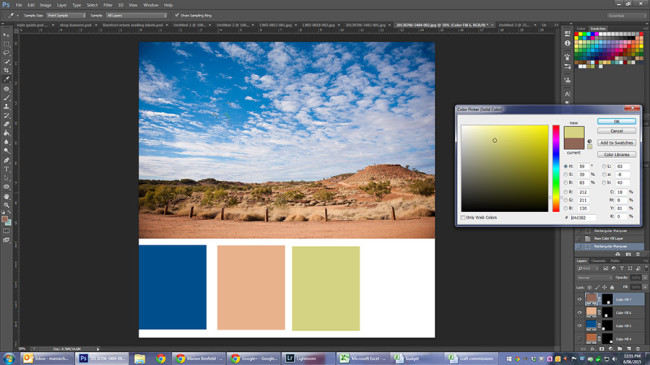
Once you have the fill dialogue up, you need to pick your colour. First up, I wanted a rich blue from the sky, and used the eyedropper to pick a blue from the top left area.
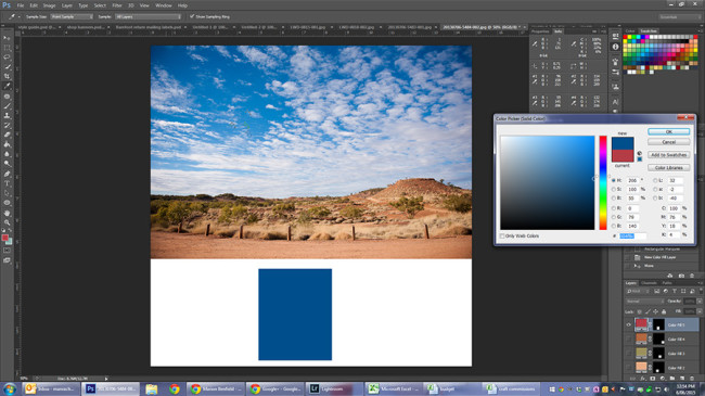
Then the next obvious choice was a brown, which I chose from the foreground, and using the rectangle marquee tool and a new fill layer. Using fill layers makes it very easy to change up the colours if you aren’t happy at the end.
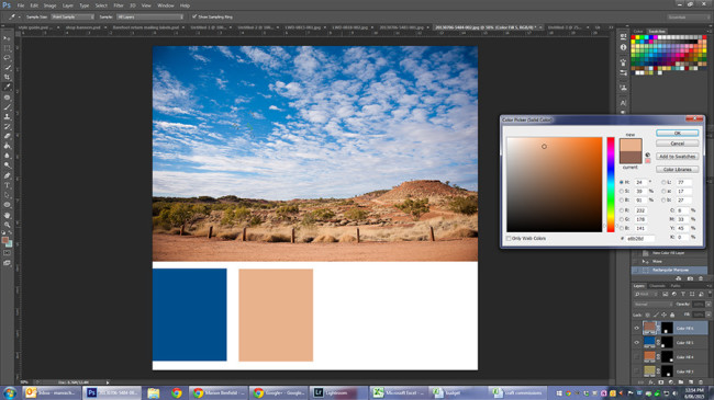
Then I needed a couple of secondary colours - I decided to bring in some green for the trees. This was a bit trickier, and I went through a few options:
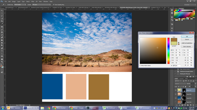
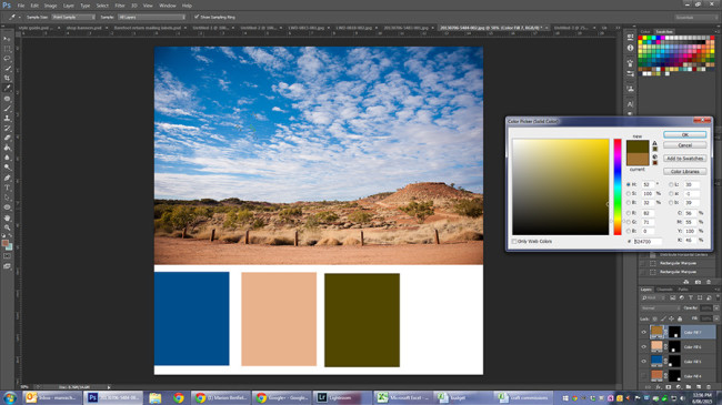
These three different colours all came from the same tree, just shifting my dropper slightly. I ended up deciding the last one was the closest fit to the feel of the photo - the top was too bright, and the middle wasn’t green at all! If your first colour choice isn’t right, shift around a bit in the same area to see if you can come up with a better fit. For my last colour I wanted a deep red/brown, and decided towards the top of the plateau on the right was the best place to start. Again, it took a few choices to get where I wanted:
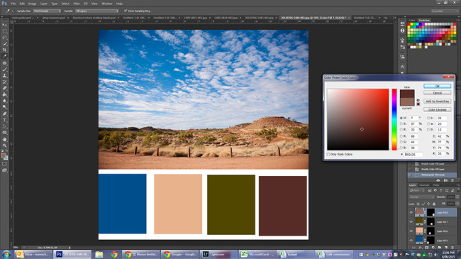
Giving me a final colour palette that looked a bit like this:
I still wasn’t totally sold on the blue. I could have gone down to my layers palette in photoshop and double clicked on the blue colour to adjust the fill, but I actually had a little cheat - I already had a palette I’d created while on the phone to my mother-in-law:
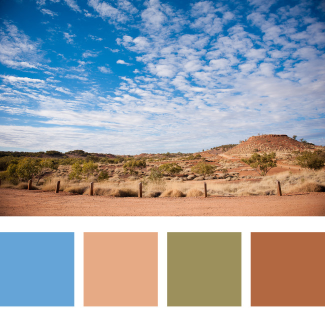
That blue looks much better! I was able to overlay the swatches and flick layers on and off to find my favourite combo, and ended up deciding on:
Now, I hear you ask, that’s all well and good, but what would I want to do that for? Well, maybe you might want to do it because it’s pretty. Maybe you want to build a brand palette. Or…. I decided to use this to take my landscape photo and turn it square without cropping to fit in a square project life page. Except then I realised I didn’t have any protectors on hand, so I went and created a digital Project Life layout instead.
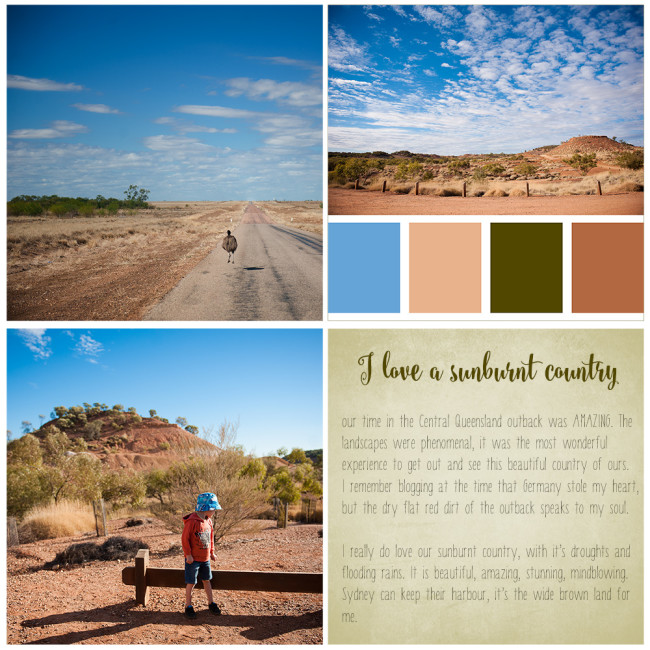
My super quick digital Project Life layout
To create this, I opened a new file sized 12×12″ at 300dpi. I had the two photos on the left squared already, so resized to 14.82cm each and copied onto the document. I resized my colour palette, and pasted it in, and then added a stroke (via the edit menu) around the outside because the white below the swatches made it look wonky. A new fill layer in the bottom corner was originally the dark green, but I changed it to a paler shade, added my text (using Steelheart for the heading and Barranti for the body text), and then decided to add a texture to give it a little bit of interest. Done! It’s only simple, but I’m very happy with the result for 15 minutes in Photoshop. Now. What photo shall I palettise* next?
*disclaimer - this isn’t actually a word
disclaimer #2 - links to fonts may be affiliate links and a small commission may be received at no extra cost to you
I'm a wife and mama who loves to craft. I love creating, and have never met a hobby I didn't like, though my main vices of choice are quilting and sewing, photography & memory keeping, knitting and crochet, art, and creative writing. I blog my eclectic crafting journey at http://thebarefootcrafter.com, and you can find me on most social media at @barefootcrafter


 Crochet Along: Let's Start!
 Crochet Along: How to Change Colours
 DIY: Sewing Machine Extension Table

Leave a Comment